We didn’t start Lettra’s landing page from a picture. We started from a list of what the library can do: text that bends with the surface it’s printed on, words that react when you touch them, fast rich text inside a canvas that updates the moment you edit it, words that get torn out of a wall. The brief was one line long: this page has to show the things the library can do instead of just mentioning them.
We started with one experiment per feature, each one answering a single technical question. The look came last, and it’s what stitched the experiments into one place you scroll through: an autumn tree on a hill, a koi pond, a sheet of paper someone lost on the shore, and a room full of old TVs.
Making each effect work was the easy part. Making them feel like the same piece was the hard one. The painting had to stay a painting when the camera moved, every chapter had to hand off to the next without a cut, and all of it had to run on a phone.

The whole site is one number
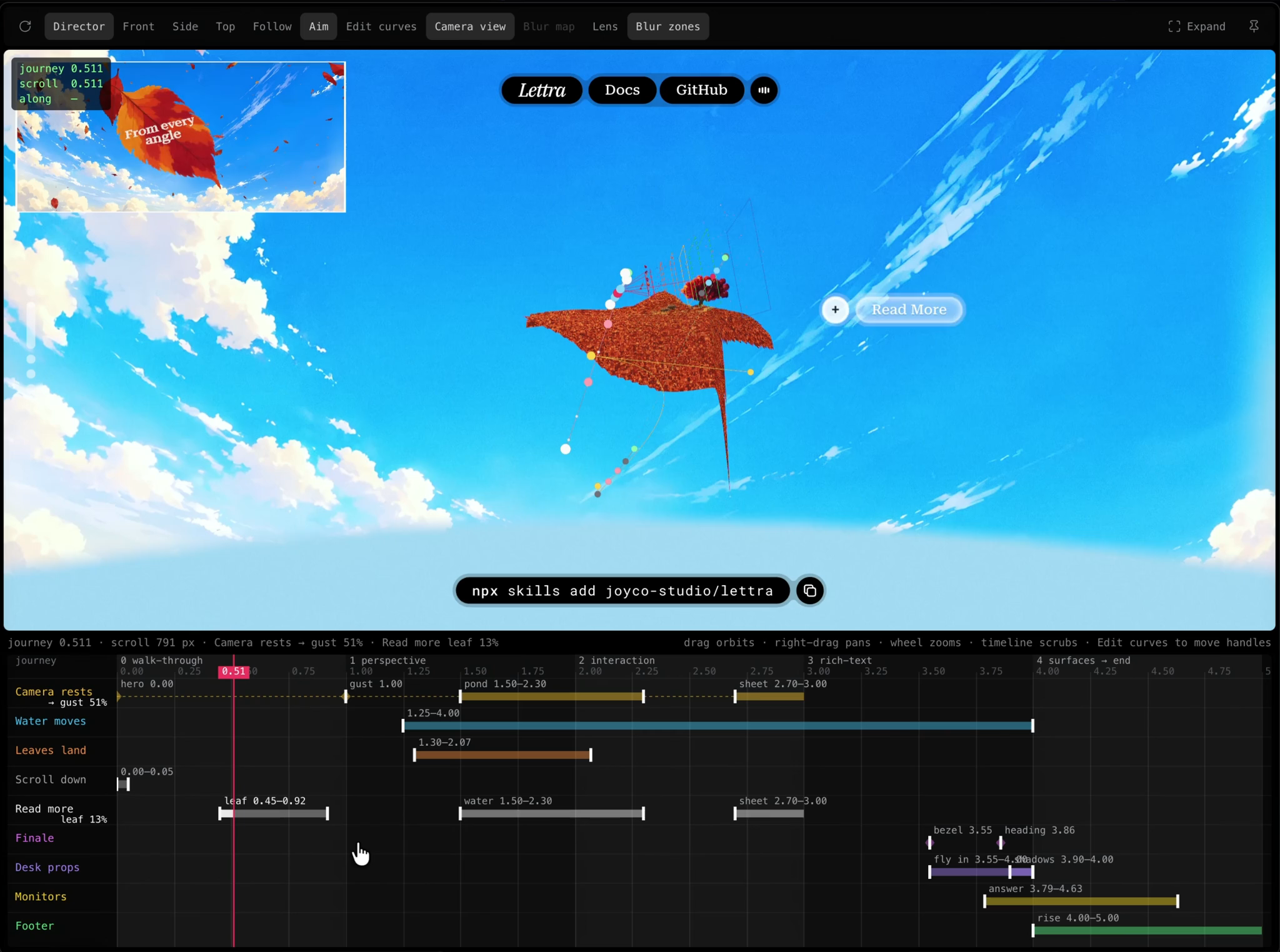
Behind the scroll there’s a single float we call the journey. It goes from 0 to 5, one unit per chapter, and everything that moves reads it. The camera travels along béziers between shots, the water starts moving at 1.25, the desk props fly in between 3.55 and 4.
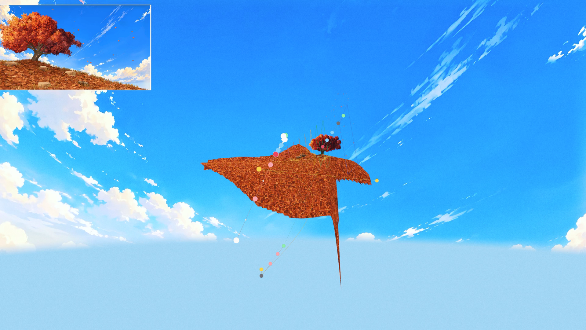
Since nothing keeps its own state, the whole site plays backwards for free. Scroll up and the gust rewinds.
Fine-tuning the look
You can’t tune a painterly scene from a config file. You have to look at it, and the loop between has to be instant. Every value of the look is a TSL uniform, so changing one recompiles nothing.
On top of that we used , and built what Lettra needed into it: a timeline to scrub the journey, a free camera that shows the real one with its curves, and one panel per chapter.
Hero: painting first, 3D second
The goal we kept coming back to was simple to say: from the hero camera it has to look exactly like the illustration, and the second the camera moves, the depth has to be real.
There are no lights
There isn’t a single three.js light in the hero. Each material lights itself with a Lambert against a shared sun direction, then squeezes the result into two tones with a short smoothstep, the way a brushstroke has a shadow side and a lit side and not much in between.
We went this way because with PBR the color you see is color × light × roughness × tonemapping, and it never landed on the painting’s browns. Lighting it by hand let us pick the exact shadow and highlight colors. No shadow maps to pay for was a nice side effect.
The canopy is a painting in layers
The trunk has no leaves, and its bark grain is remapped to the painting’s three browns.
The leaves are painted clusters in three tones (shadow, body, sun) hanging from points sampled in Blender along the thin branches. Each cluster always faces the camera and gets clipped by the silhouette of the original illustration, so the crown never grows past the drawing.

From the hero camera it all reads as one flat illustration. Move the mouse and the layers start sliding over the real branches behind them, and that parallax is the only hint that any of it is 3D.
Koi pond
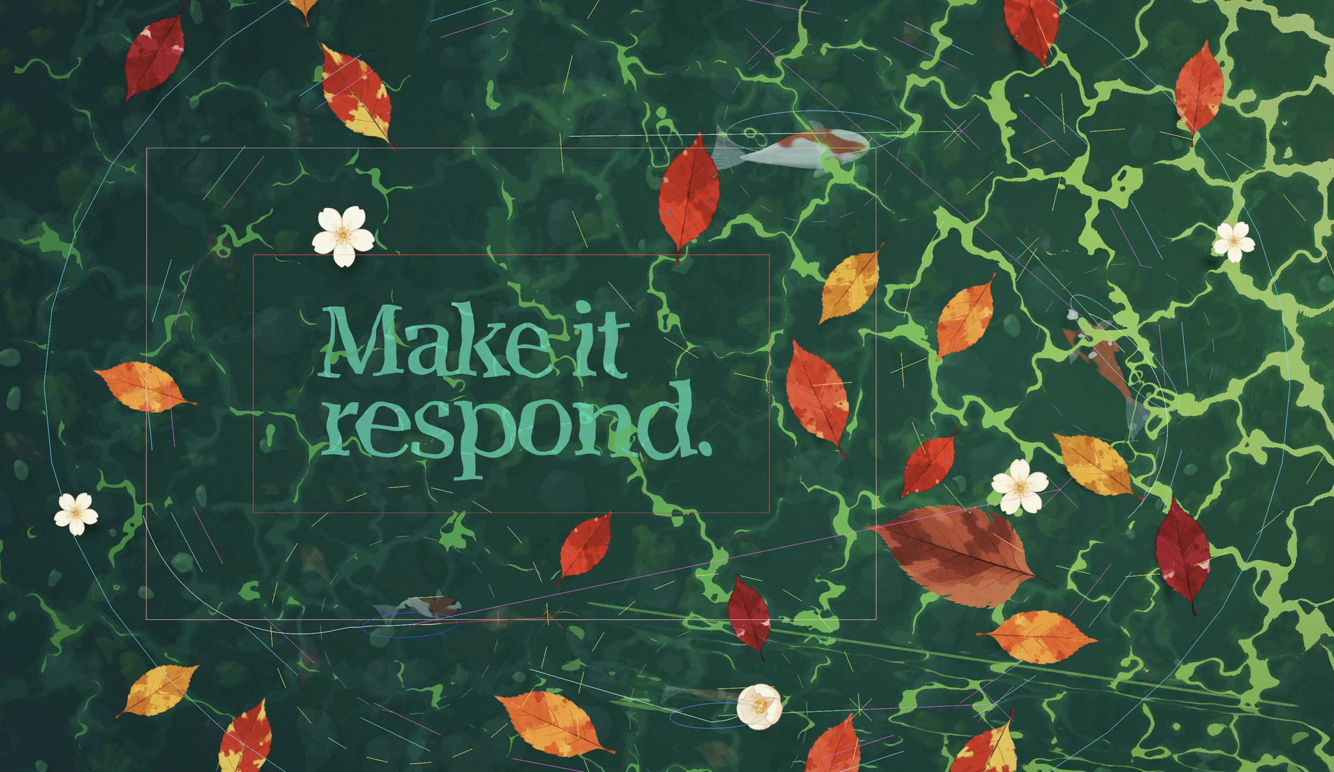
The second chapter is a pond seen from above, with koi swimming over the section title.

The title is a stamp, not a mesh
The ripples live on the GPU, so the title can’t be a mesh floating on top with no idea of what’s happening underneath. The words are printed once as a mask, and on top of it runs an ink field that the finger and the ripples drag around. When the water calms down, the ink settles back into the shape of the letters on its own. It’s drawn under the surface: the pond is composited over the text, not the other way around.
Steering
Each koi , keeps a bit of space from the others, steers around the title and away from the shallows, and runs from your finger farther the faster you swipe.
None of that got tuned blind. Studio has a koi viewer that draws every decision over the water, with a slow-motion slider to follow one fish while it makes up its mind.
A fish with no textures
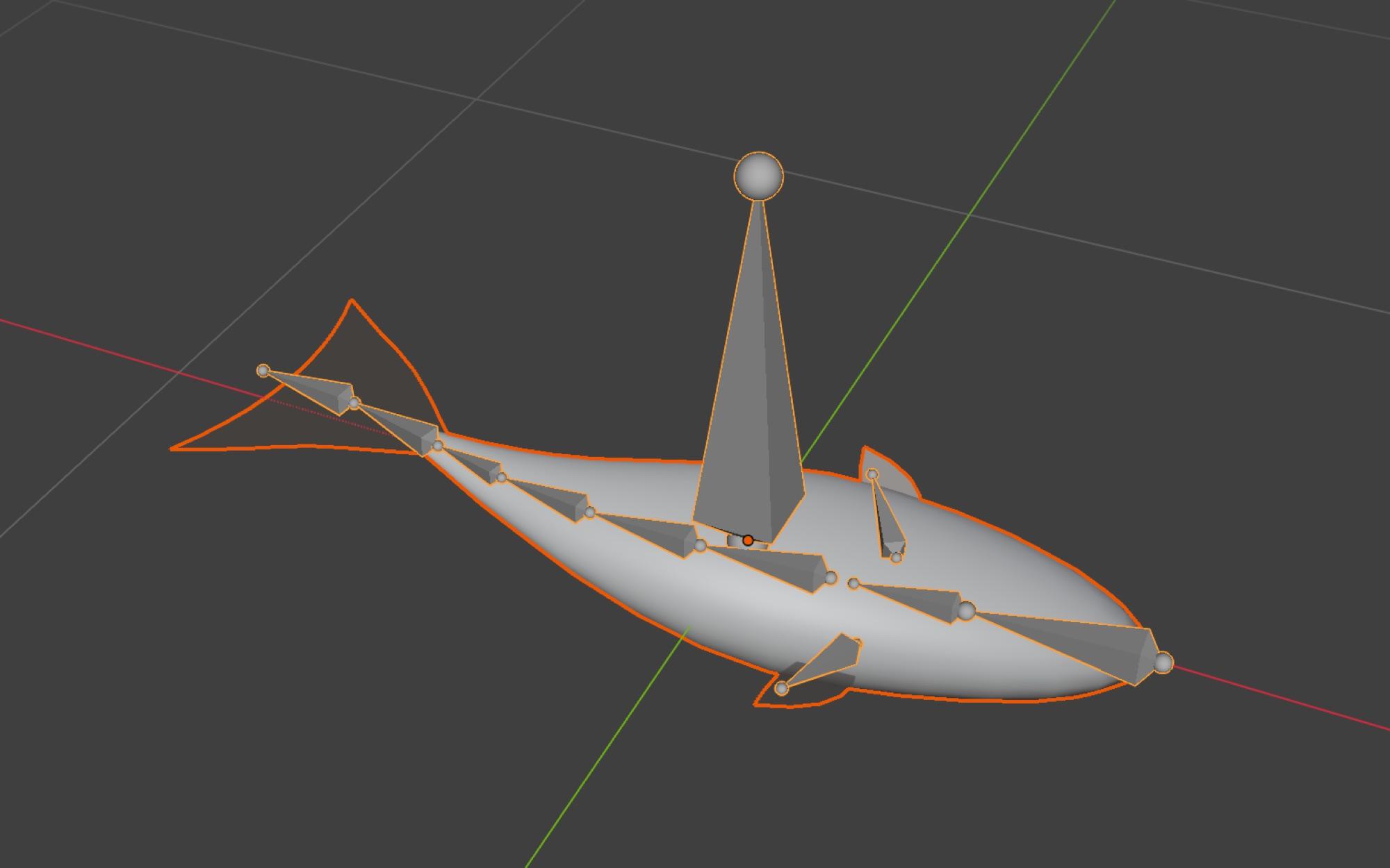
The koi is minimal on purpose. It started as a mesh in code and went into Blender through Blender MCP to get its bones and its swim.
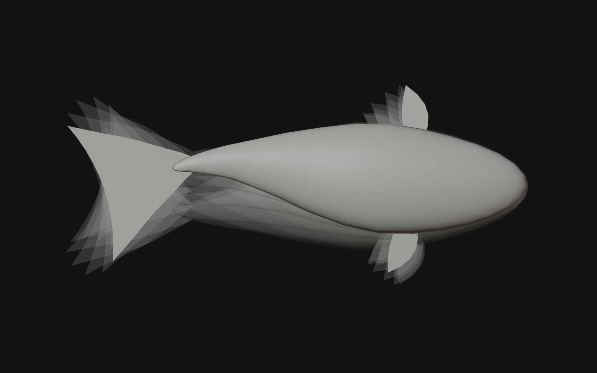
Bending the body in a shader never felt like a fish swimming, so the swim lives in a rig: 11 bones and a single swim clip that plays faster as the fish speeds up.
There are no UVs and no textures. The breeds (kohaku, sanke, showa…) are patterns built in code, so they’re easy to tweak, and the whole school shares one material.
Finale: the TV room
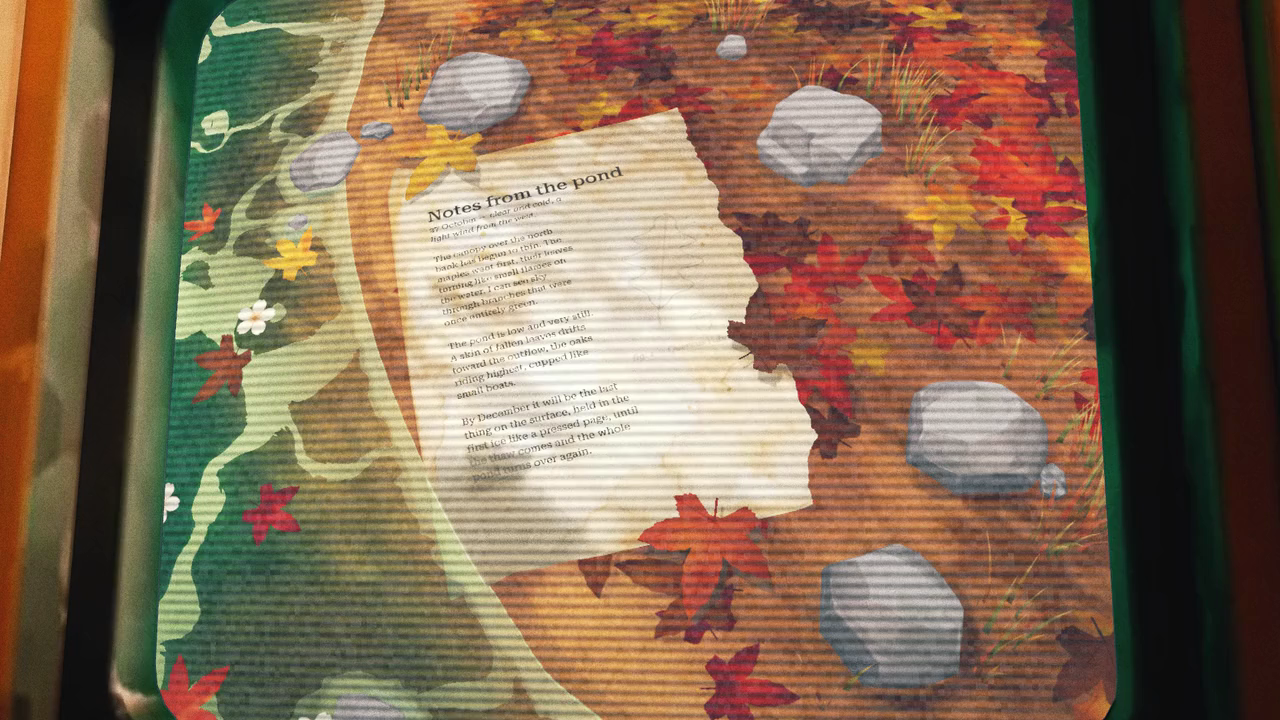
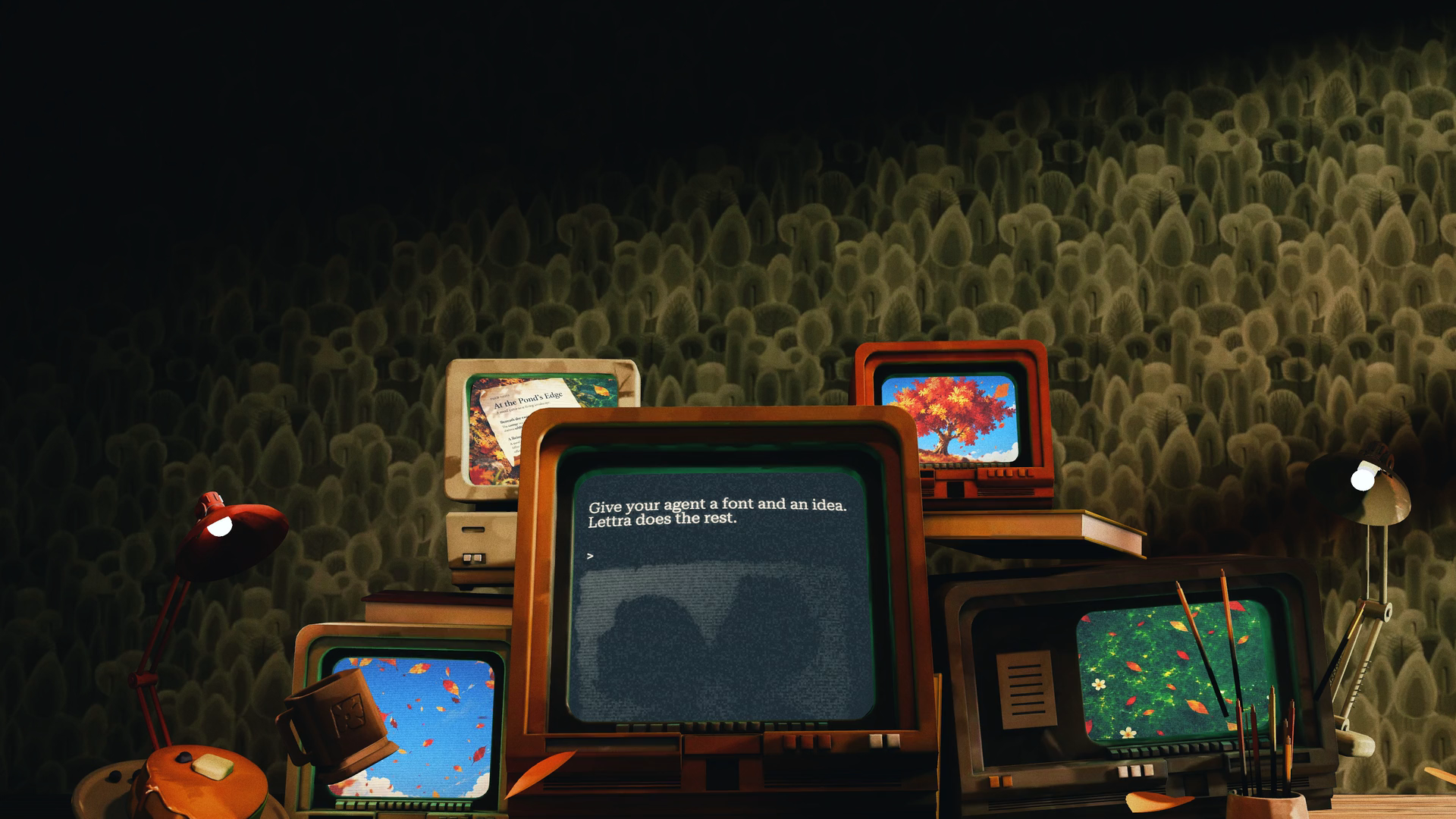
The last chapter is a desk piled with old TVs, each one looping a chapter you already scrolled past. Under the desk is the footer.
From a concept to Blender
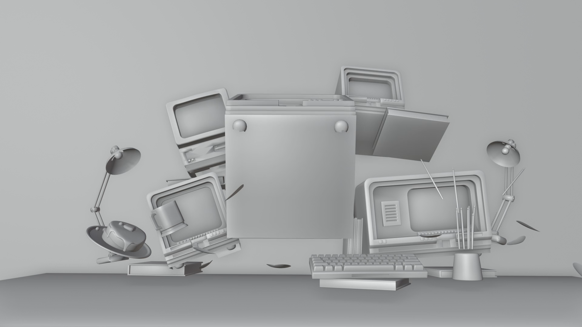
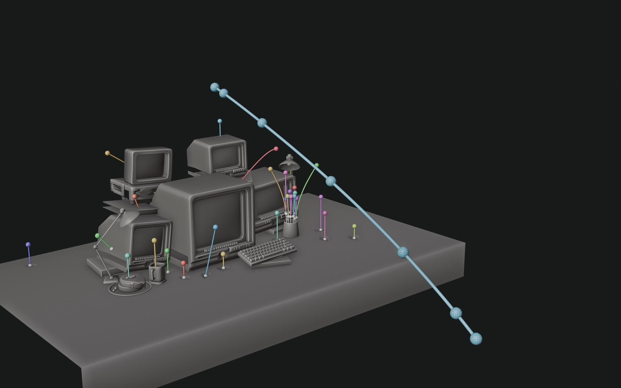
The room started as an image concept. We took it into Blender through Blender MCP to get a rough 3D scene fast, something we could drop into the site to test framing and proportions without waiting on a final model.
Drawing the camera first
The camera move was a sketch before it was a single keyframe.
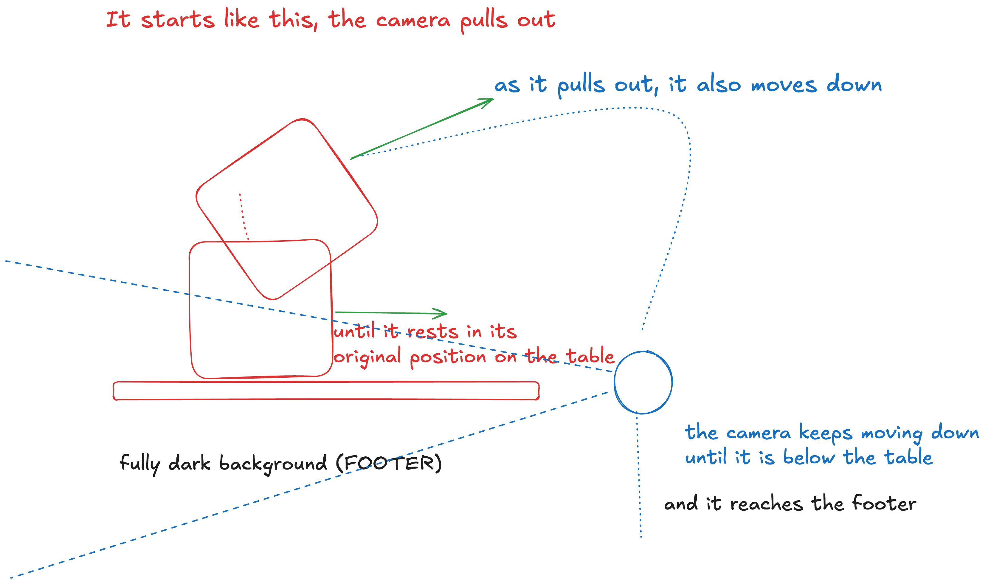
It starts right above the main TV, which is lying face up, and pulls back. While it pulls back it also drops, and the TV rotates until it’s sitting on the table where it belongs. Then the camera keeps going down, past the edge of the table, until everything behind it is dark, and that’s where the footer is.
That sketch, plus a few passes against the camera of the rest of the site, gave us a first version to play with.
Polished by hand
The first pass was rough. In the last stretch our 3D and design team reworked the camera and every prop’s animation by hand in Blender, brought the polygon count down and cleaned up the meshes.
The animation lives in Blender
Every prop on the desk (the side TVs, the books, the lamps, the pencils) has its own clip in the exported GLB, all on one timeline, and the camera rides in the same file. The site never plays those clips. It reads them at whatever time the scroll says, one clock for all of them, so they move together the way they were timed in Blender. Stop scrolling halfway through and the props still in the air don’t freeze: on top of its clip, each one bobs and tilts a little on its own rhythm, so the room never looks paused. The float fades out as each one lands.
The nice part is that changing a move doesn’t mean touching code again: the artist updates the GLB with the new animation and the site picks it up.
Baked light, fake glow
The room’s lighting is a Cycles bake drawn as is, with no lights in the scene.
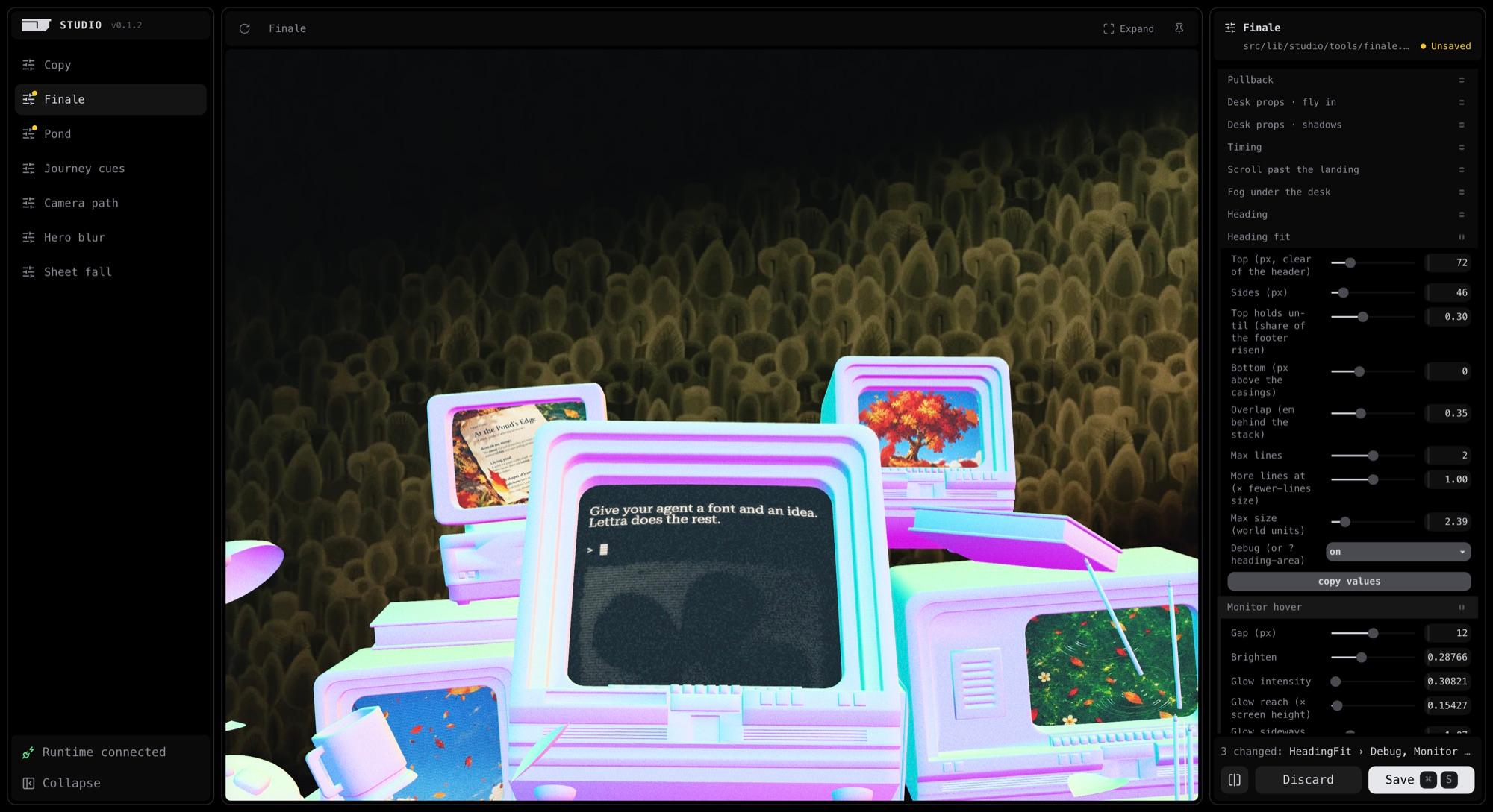
That leaves the interactive bits to fake. Point at a monitor and its screen seems to light up the casings around it. : each pixel of a casing measures how far it is from the glass and how much it faces it, and takes the screen’s color in that amount.
The flying props created one more problem. A baked table would have their shadows painted on it before they ever land. So the room is baked twice, with the props and without them, and the difference between the two comes back as a shadow mask that fades in as they touch down.
Color grading
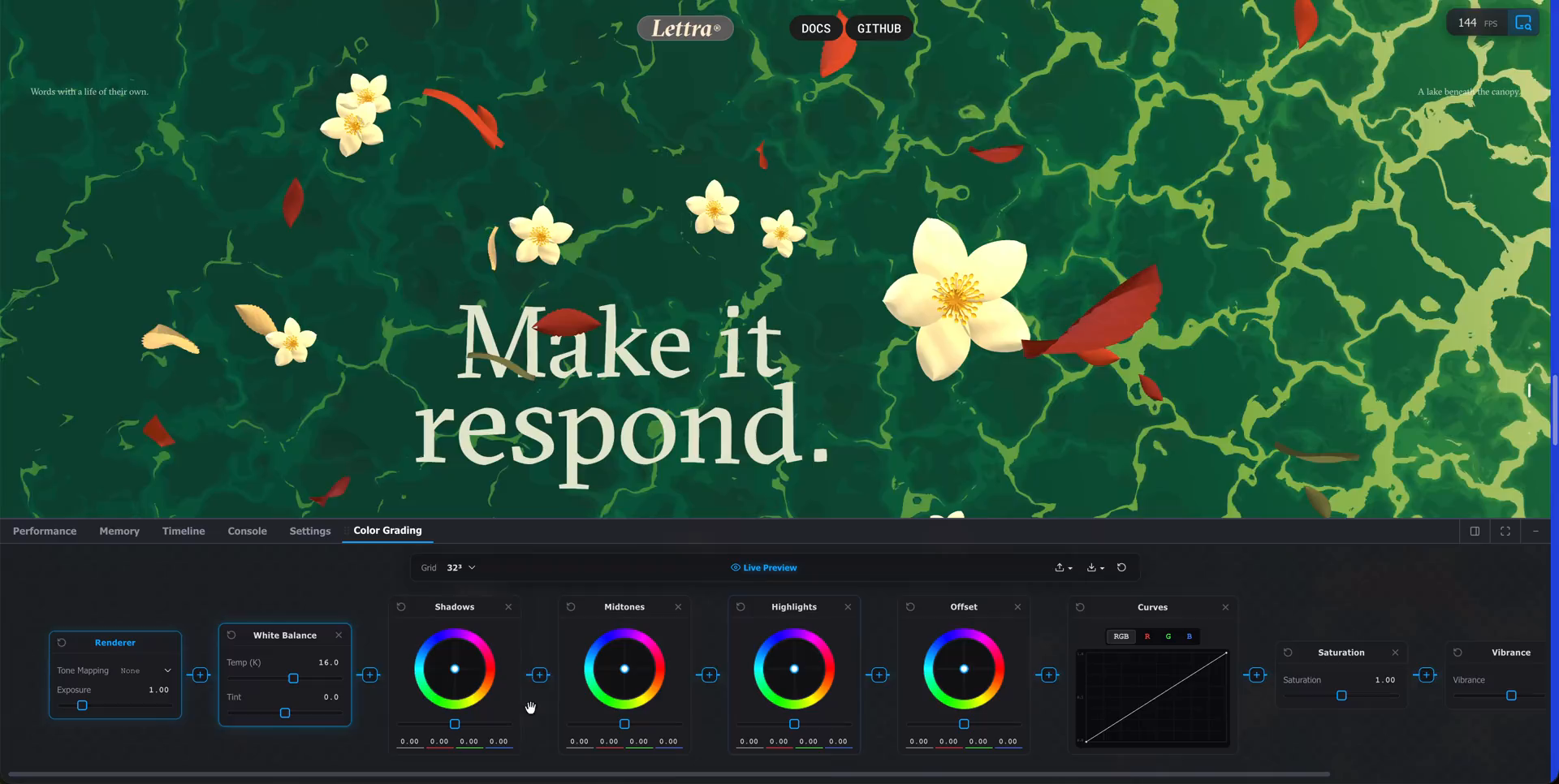
The grade was done in the Color Grading tool that ships with the three.js Inspector. It has visual nodes and shows the result live on the actual scene, so whoever is grading doesn’t need a developer next to them.
What comes out is a JSON with the steps (exposure, white balance, curves, saturation, vibrance). The site turns that into a 3D LUT with the same math the Inspector uses, which means production looks like the tool did when it was saved.
Down to the footer
The footer, the heading and the Lettra wordmark all live inside the room. When you reach the end the camera sinks with the footer, and the page doesn’t slide up like a regular page would. The HTML follows the scene.
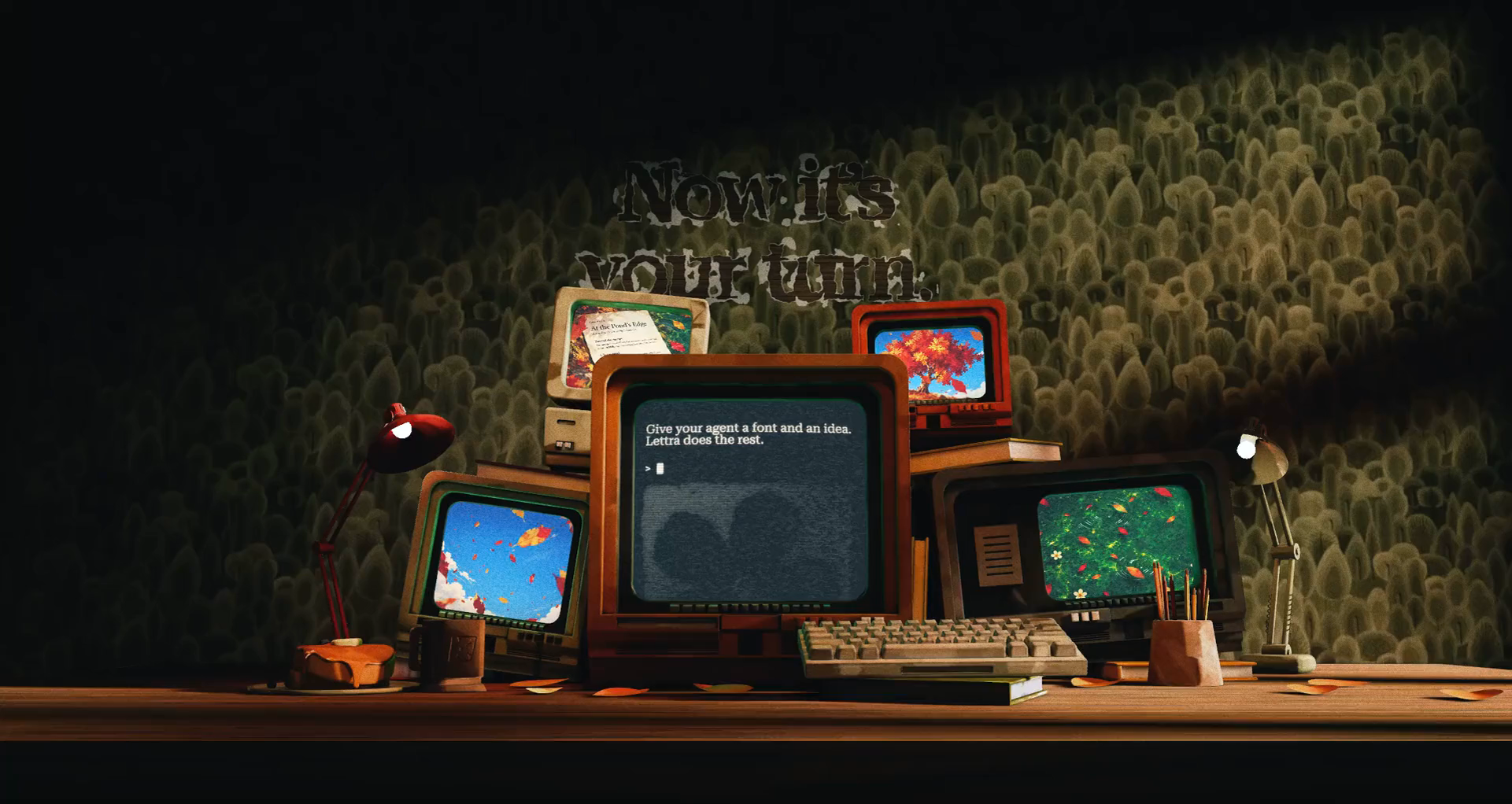
You can smudge the wordmark with the pointer like wet ink.
If you want to poke at the real thing, it’s at lettra.dev, and the project page is in our showcase.