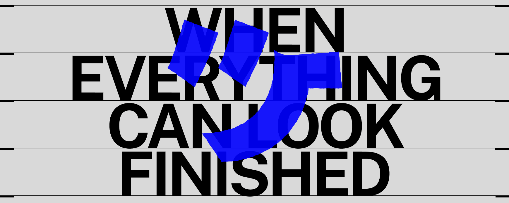
Today you can see 15 versions of your brand before you’ve even asked what it needs to say. This creates a lot of confusion between branding and a collection of cool visual elements.
AI can do 90% of the work and make you believe it’s finished. It’s easy to shift your attention from the storytelling to how something looks.
Through the filter of an algorithm, you see a style replicated so quickly that five seconds later it’s already detached from its original meaning. Your own voice becomes an average of things someone else chose for you to see. Like mixing all your Play-Doh together, what you end up with is a facade.
Navigating all those possibilities takes judgment to discern between what works and what doesn’t. That can’t be compressed into a SKILL.md. But plenty of decisions can. We need to be precise about which ones.
At JOYCO we work mainly with tech startups. They move fast. You can’t ask a founder to create a ticket for everything, especially another version of slide 151 that we should have figured out already.
For us, defining a brand today means making it legible enough for an agent to understand it(1), leaving us room for the things that matter.
Having something to say
Before deciding what we can automate, building a brand starts with thinking about what to say.
Sazabi was our first project of the year. The starting point was a mysterious yet expressive landing page blending the red Sazabi from Gundam with Iron Man and a moodboard that mixed Daytona, Call of Duty and Rock Band posters.
We quickly understood how Sazabi’s mission was about bringing clarity to the observability space, which was full of foggy dashboards. For the designer audience: observability is understanding what’s happening inside your software by looking at specific outputs. With this in mind, we needed to Find the Signal.
Once you find what you need to say, you need to find how. We didn’t want another black and white clean landing page, we wanted a brand that felt technical yet expressive.
You can imagine ten different brands that follow this premise. A father crossing dangerous terrain to find his child could be Taken or Finding Nemo. That’s why you make a moodboard.
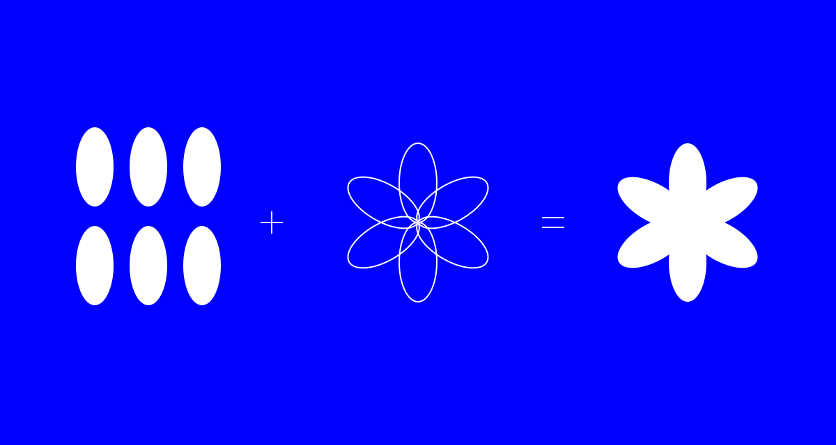
A moodboard is about shaking hands with your client. It means breaking down why each element is relevant. For Sazabi, we condensed it into six images.
We can disagree about whether a reference is cool as long as we understand why it does its job. You can easily achieve technical with a monospaced font, but we followed the white rabbit and ended up finding those values in an old Roland logo lockup.
Defining just enough to let it change
Once we had a voice for Sazabi, we needed to understand what held it together.
Consistency and coherence(2) help me think about that. Coherence is understanding why different expressions belong to the same world. Consistency is defining the choices that make those connections recognizable and repeatable.
For Sazabi, coherence started with finding the metaphor for our hero section. A giant robot made sense: the company takes its name from Sazabi, a robot from the 1988 Gundam anime. But the connection grew deeper when we imagined it watching over a city, detecting faults in its electrical circuits just as the product looks for faults in your software.
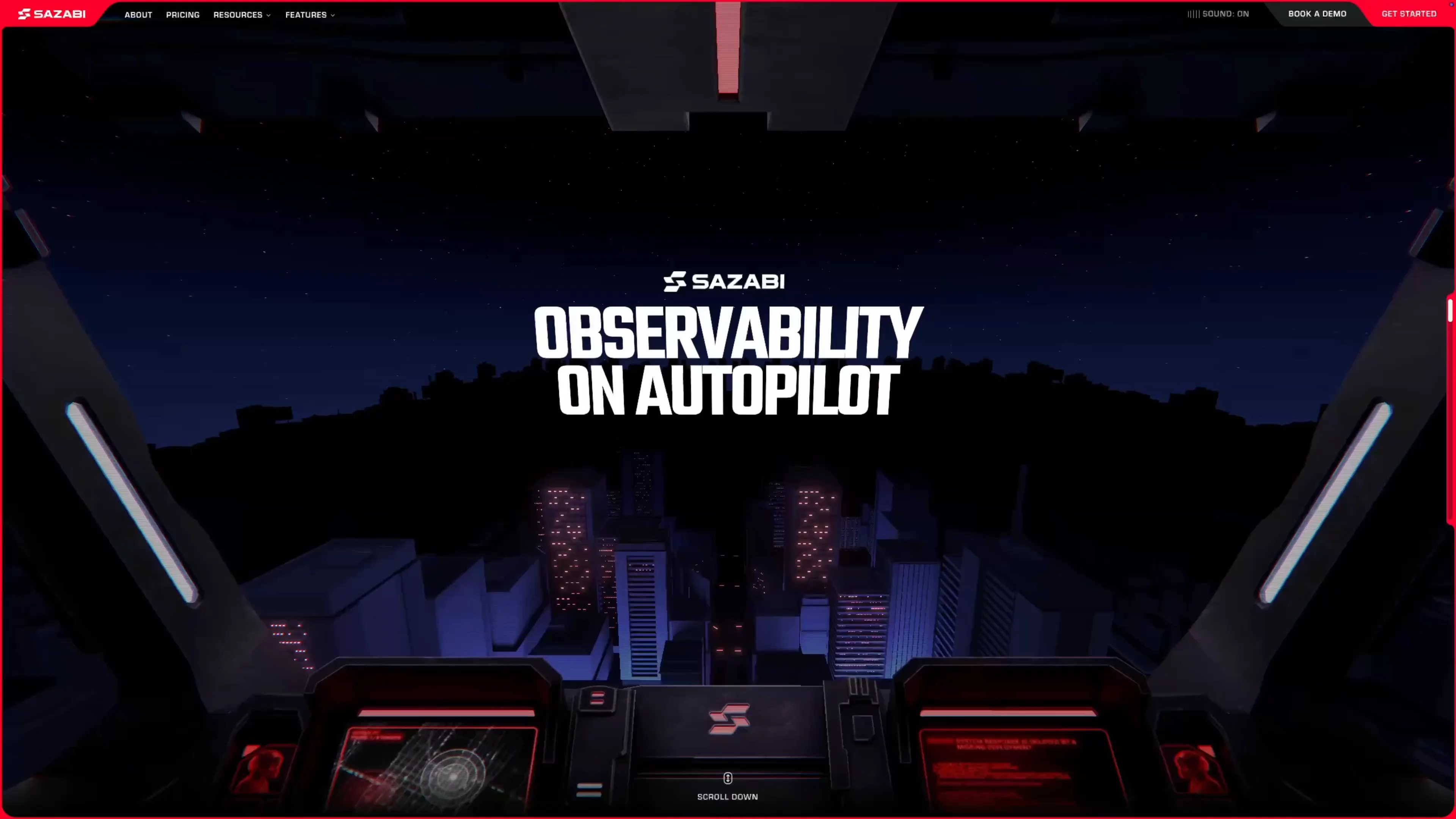
Our work starts to develop once we give it some constraints. Each application helped us understand how those choices could work somewhere else.
Consistency allowed us to carry that idea into the rest of the brand. We defined the colors to let the red shine, with a broad range of grays that the team at Permanent would carry into the product interface.
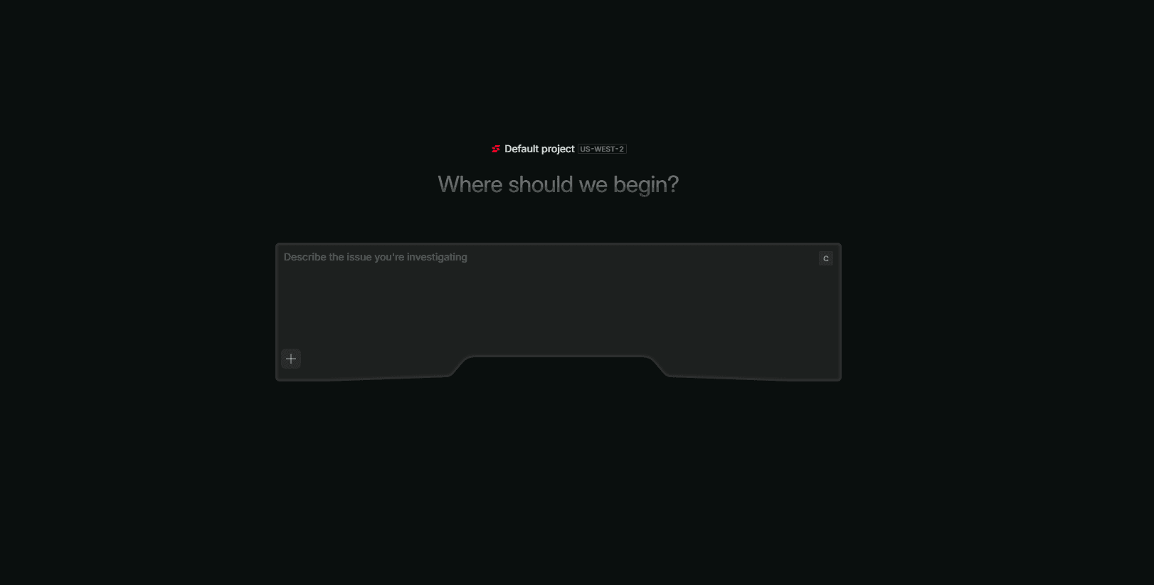
The cut shapes of the visor also shaped the buttons and cards, translating an idea into concrete, reusable components.
The team carried the visor’s shape into the main prompt field, where you ask Sazabi to investigate a problem. The idea gave us a direction for the design. Seeing it carried through to the product makes that idea credible.
Levels of brand expression
I saw Vicente Lucendo at Three.js Conf explain how Messenger uses levels of detail, or LOD, to keep detail where you’ll notice it and simplify geometry elsewhere. That improves performance by putting resources where they make a difference.
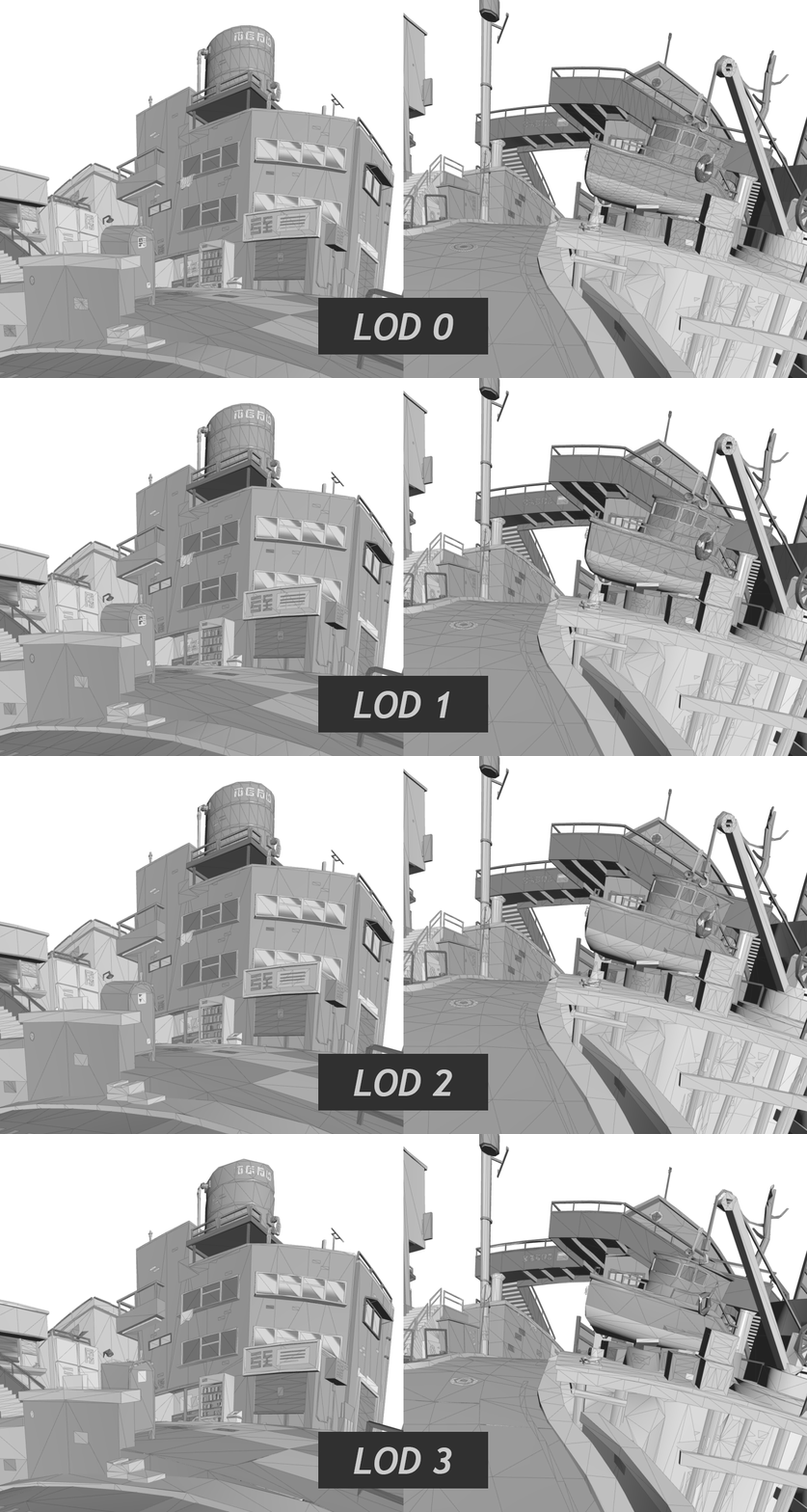
Each part of a brand has different resources to work with. What I think of as levels of brand expression helps us decide where to leave room for interpretation and where the choices we’ve already made can carry the idea.
The product belongs to Sazabi’s world through its palette, red accents and the shape of the prompt field. It doesn’t need the whole city. Those details are concrete enough to document, but recognizing that they could hold the experience together took the judgment we started with.
Room to care
Speed should buy us room to care. Once those decisions are documented, we can spend more time finding the next connection worth making.
Even the same page can need different levels. You need to constrain the system enough to make the design of your everyday pricing table obvious, while leaving enough freedom to design a different robot for each pricing tier.
To do my job well, my team and my client need to agree on what we can resolve in ten minutes and what needs an extra day. That means understanding where to put our effort and where our judgment can make a difference.
Taking a design project forward means negotiating between the ideal and the possible. A shared understanding of the brand makes that conversation concrete: these choices are settled, this part needs another exploration, and this is what we expect that exploration to contribute.
In a world moving this fast, we need to think carefully about how we work. I want to move quickly so I can give my attention to what matters.
How much of a brand can you write down?
In Sazabi’s case, we can define the range of grays that lets the red stand out, the cuts that give shape to the components, and examples of how those elements work together. These choices make the brand legible: another designer or an agent can understand them and put them to use.
We can also explain why the visor became a prompt field, giving the next person both a shape to reuse and a reason for using it. That makes the relationship legible: they can repeat the choice consistently or build on the idea while keeping it coherent with the rest of the brand.
Levels of brand expression help us define where those instructions are enough and where to leave room for interpretation.
That’s what I want to leave behind: a brand people understand well enough to keep developing. The decisions we document become a starting point for someone else’s judgment, including the things we haven’t imagined yet.
References
1. Sean Goedecke, Seeing like a software company. On legible work that organizations can track and predict, and the less legible work they also depend on.